Dec 10, 2006

1 new wallpaper (Artist/Kazuhiko Tsuzuki: Fly)

1 new wallpaper:
Artist/Kazuhiko Tsuzuki - Fly (Vector/Minimalistic)
Made on a whim. Wanted something simple, with clean lines. Just a girl on a swing among the clouds. Childlike whimsy and a sense of flight... [more]

Dec 6, 2006

1 new wallpaper (Full Metal Alchemist: Route 66)

1 new wallpaper:
Full Metal Alchemist - Route 66 (Vector/Scenic)
When I first saw this scan, I thought the white ruff of Ed's red jacket looked like a Santa suit. For some reason, I decided to then use that scan for my annual winter wallpaper, despite the fact that Ed is not actually wearing a Santa suit. Go fig... [more]

Dec 1, 2006

Ramblings on Mushishi: Mata Itsuka

NOTE: I just found this half-finished entry in my "potential blog topics" Google Notebook when I was doing some testing during work, so I decided to finish and post it, no matter how late it is.

One of the motivations behind turning my recent Mushishi wall, Mata Itsuka, from a vector-only wall (like Oyako) to a painted wall was to gain more familiarity with Corel Painter 9. I've had Painter for years (although only upgraded to 9 last year) but have only used it extensively for a few wallpapers. Frankly, having no experience in natural media aside from pencil/pen and paper, the number of options overwhelms me, and I have no basis for understanding how the oil-based brushes are supposed to work compared to, say, oil pastels. Still, a painting-based wall was just the excuse necessary to get more practice!
The last wall I used Painter on was the Okama Hunter in the Grass wall where I used the digital watercolor brushes to create a textured background. I went back to the digital watercolor tools (not to be confused with Painter's watercolor tools which is an entirely different palette) because I liked how they maintained the paper texture, and because I like the watercolor look in general.
One of the first things I discovered was Painter's custom brush maker. This thing is about 25x more complicated than Photoshop's custom brush maker and about 50x as fun, because you can actively preview the brush while you're making it but before committing to the changes. Very slick. I wasted probably several hours just messing around with controls, although in the end I created a new digital watercolor brush quite similar to the presets but with more control over the brush size based on tablet pressure and a fixed opacity (the presets were switched in pressure control on size/opacity).
Basically, I began by painting the base color for Ginko's face, then adding successive layers of shadow and highlights. I painted way outside of the outlines as I planned to mask the final color layers in Photoshop. After several frustrating attempts to figure out how to use the digital watercolor blenders, I gave up and decided to use the regular set of blenders. However, in Painter, you have to 'dry' any liquid ink layer (such as digital watercolor) before you can use the "dry" brushes (which include blenders, oils, etc.) Afterwards, though, the regular blenders were most intuitive to use and everything went from a sorta cel-style shading to a much softer gradient-style shading.
I like Painter's blenders a lot, and plan to use them in many more painty walls.

Nov 25, 2006

Tutorial: Painting "Mountain's Red Leaves"

Here is the tutorial segment of my Hakkenden "Mountain's Red Leaves" Paint-o-rama contest entry. It describes how I created the wallpaper, step by step. Click on each image thumbnail for the full screenshot.

Step 0: Preparing the Image
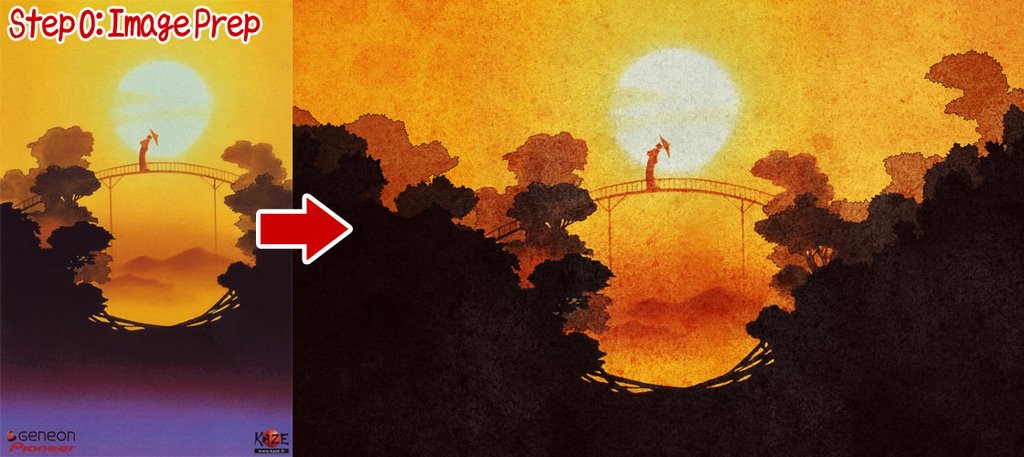
I found the scan of Hakkenden from AnimePaper and decided to use it for my wallpaper. However, to make a wallpaper I had to extend the image horizontally to fit the widescreen format. This was achieved in Illustrator, using fairly simple paths to define the shape of the trees, and then applying several effects of roughen and twist at low levels to create the jaggy edges that defined the leaves. The image was then exported to Photoshop at 200% size where some texture was added.


Step 1: Base Layer
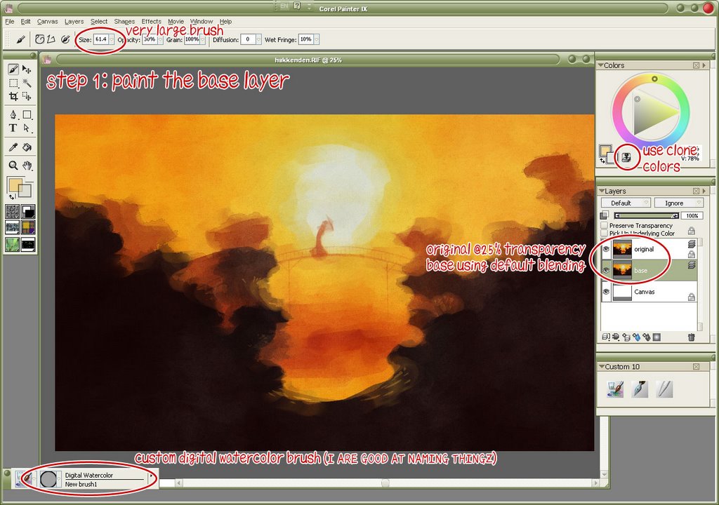
I created a new blank canvas in Painter, and then opened my prepped image, setting this as the clone source. With a very large watercolor brush I basically filled the canvas with color. At this stage it wasn't very important to get all the details right - just make sure the canvas is covered. This fills the large areas (like the orange sky and the darkest layer of trees) quickly and easily.
It's useful to have a copy of the original as the top layer in your file, set at a low transparency. Although you can use 'tracing paper' to see a semi-transparent version of your clone file, you don't have any control over it. Having it as a layer means you can show or hide at will, change the transparency levels, etc, so it's easy to see what you're cloning from.


Step 2: Start adding details
Using a smaller brush (half the size of the first brush) I began to more closely define the edges. I don't repaint the entire image, just the edges. Note that in using the watercolor option in Painter you get white halos around the brush. Be sure to have plenty of extra space at your edges, so you can easily remove them with a soft eraser when you are finished.


Step 3: Second verse, same as the first
Continue as before using yet a smaller brush. Also, be sure to lock your previous layers, as it will prevent you from painting over a finished layer.


Step 4: Small enough for details?
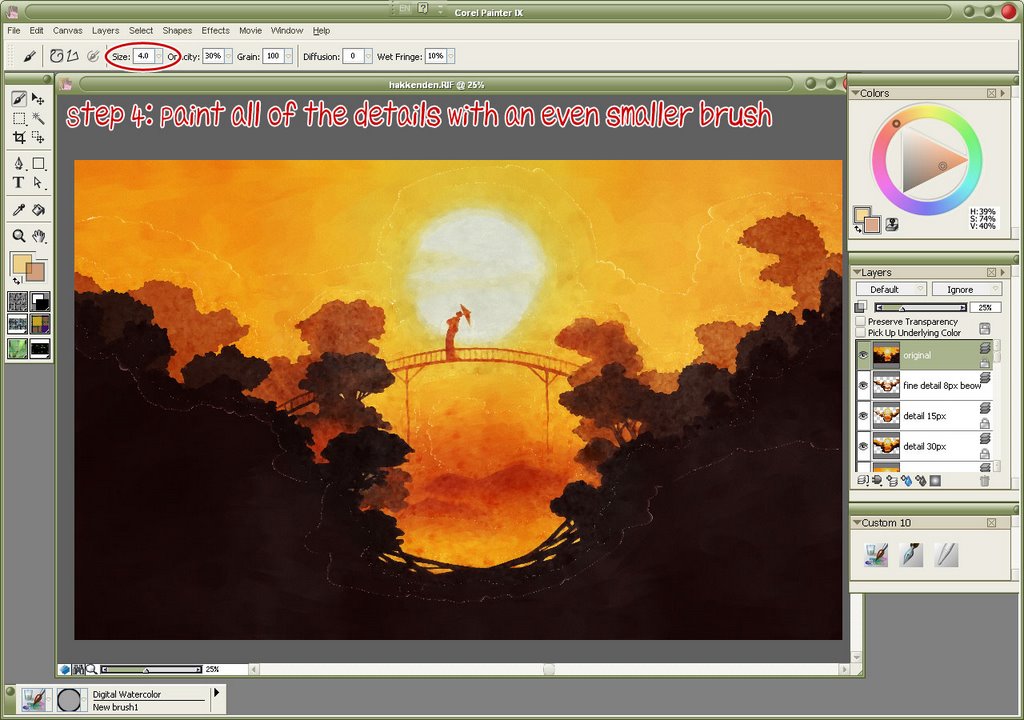
When you get down to 8px you can actually define all the details at the edges. In this step I used not only 8px brushes but also 4px and 2px for especially detailed areas (the area around the geisha, and the bridge, for the most part.)


Step 5: Blend it all together
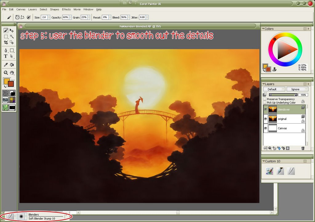
After the watercolor portion is done, you'll want to erase those halos I mentioned earlier. I did that in Photoshop (because I could select the layer's transparency and use a feathered mask on the layer.) Afterwards all of the layers were merged. The canvas was also extended ~50px in all directions and the color cloned at the top. This is because when you use the blender tools in Painter, it pulls an average color of what is beneath your brush - and at the edges of the canvas, it pulls in white, giving you a bad frame effect.
Like before, use a large blender for expediency, and smaller blenders when you're painting around the edges. Below is a typical workflow:
Step 5a: (the before shot)
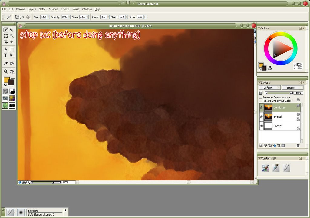
Here is the edge of a tree, before anything is done.


Step 5b: Blending the edges
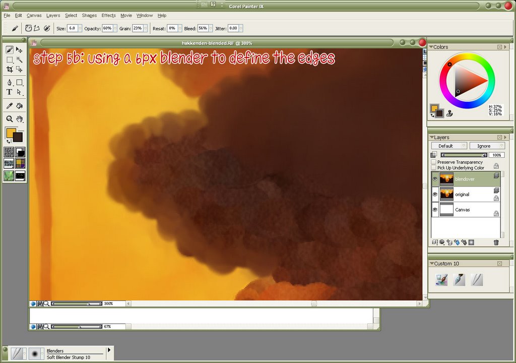
First, using a small (6px) blender, define the edges of the tree. Since all the trees have scalloped edges, make sure your brush stroke is in the same type of semi-circle. Also, by going slightly beyond the edge of the tree, you'll pull in the lighter color behind it. This gives the edges a bit of glow and adds depth.


Step 5c: Filling the interior
Using a larger (12px) blender, fill in the rest of the tree. This technique could also be useful in painting clouds, as they have the same scallop edges and lighting emphasis.


After the blending step, there were some final post-production steps in Photoshop - cropping the extra pixels out from step 5, adding a hint of texture to emphasize the painting style, text (a haiku from Issa), and final colors and levels adjustment. Finally, add your signature and post it on your website!

1 new wallpaper (Hakkenden: Mountain's Red Leaves)

1 new wallpaper:
Hakkenden - Mountain's Red Leaves (Painted/Scenic)
I found the scan to be interesting in composition - the simplicity in the trees framing a round bridge with a geisha made a not-so-typical scenic setting, plus the orange-y autumn colors were quite refreshing... [more]

Nov 22, 2006

1 new wallpaper (Brave Story: Gathering Rain)

1 new wallpaper:
Brave Story - Gathering Rain (Vector/Scenic)
I chose the scan for the fantasy elements and because it had reflections. I love reflections, and I liked how the still water reflected like glass. I kept most of the image the same, but chose to have only water and sky (to increase the isolation of the picture and to enhance the idea of space) and decided to go for some larger, more dynamic clouds instead of the cute little fluffy things in the original scan... [more]

Nov 15, 2006

Possibly useful color tool

Found via Google Blogoscoped: an Instant Color Schemes generator which uses a Yahoo image search API to generate color swatches based off of any query -- it analyzes the colors in the image search and returns six colors per image for a total of 5 schemes.
Although the results are rather hit-or-miss ("rain" has several red/orange sets) the sets it generates regardless of query might be useful for getting ideas for color settings in web design or walling if you're feeling stuck. At the very least it might give some thoughtful ideas.

Nov 1, 2006

1 new wallpaper (Mushishi: Mata Itsuka)

1 new wallpaper:
Mushishi - Mata Itsuka (Vexture/Scenic)
The Mushishi walling project continues. This wall started with a simple trace of the ending illustration to Mushishi 26. With the calligraphic brush style I thought I'd make a wall similar to Oyako. Then I thought I'd do some coloring in Painter. Then... [more]

Oct 17, 2006

1 new wallpaper (Magic Knight Rayearth: Visions of Cephiro)

1 new wallpaper:
Magic Knight Rayearth - Visions of Cephiro (Vexture/Scenic)
I just thought this scan was interesting. Probably the sun-in-glory design drew me in. Also, the lack of characters. I've been getting a kick from walls with very small (or in this case non-existant) character art lately... [more]

Oct 12, 2006

Screen size statistics

I've been using Google Analytics for several months now, and one of the most fascinating things I've learned about my site visitors is how many people still use relatively small monitors.
50% of my visitors use 1024x768. This doesn't surprise me, I know this is still the most common resolution.
20% of my visitors use 1280x1024, which is the same resolution I use at home. The increasing popularity of LCDs which tend to be of the 5x4 ratio explains this fairly well.
Surprisingly, a solid 8% of my users are on 800x600. This is the third most common resolution of DA!'s visitors. There's a reason why we're still told to make sure our designs fit in 800x600 screens at work. That's 1 out of every 12 visitors to my site!
In a graphics-savvy community where 1280x1024 is considered small, people still need to remember: design your website for the least common denominator -- the 800x600 crowd. They're still a sizable portion of the internet at large.
(This of course means nothing about designing wallpapers; design them as large as you feel like, for sizing down will leave less artifacting on the image than sizing up.)
As a final note, widescreen resolutions are growing in popularity as well - a bit over 10% of DA!'s visitors use a widescreen (16x10) resolution.

Oct 5, 2006

1 new wallpaper (Dark Craibe: Letort Nouveau)

1 new wallpaper:
Artist/Tachibana Kaim - Letort Nouveau (Art Nouveau)
The original art was already done in Art Nouveau style, and has been my favorite image of Letort for years. It's about time I actually walled it. Plus, Letort is hawt. Hawt guys on my desktop, mmmmMmm... [more]

Oct 1, 2006

1 new wallpaper (Cafe Kichijouji De - Superstition)

1 new wallpaper:
Cafe Kichijouji De - Superstition (Vexture/Minimalistic)
This is my Halloween wallpaper. "Why Tama," you say, "Why is your wall done a month ahead of time?" Oh, gentle reader, it is because it gives you a WHOLE MONTH to enjoy it. I chose the scan after strolling through the CKD scans and thought the image was just too funny to pass up. The original scan had a haunted house with flashing lightning, but nothing is scarier than a humongous, looming Sukekiyo... [more]

Sep 22, 2006

Too many things

I need to stop adding to my work in progress notebook. Or figure out a way to make these walls in 1 hour or less.
Aiyah.

Sep 17, 2006

New wallpaper (Honey and Clover - Inspire Me)

1 new wallpaper:
Honey and Clover - Inspire Me (Vector/Minimalistic)
What inspires you? When you look at that blank canvas, what gets you started? Is it another wallpaper? Is it a commercial design? Is it another art style? Is it music?... [more]

Sep 10, 2006

New wallpaper (Kino no Tabi - The Road Ahead)

1 new wallpaper:
Kino no Tabi - The Road Ahead (Vector/Scenic)
This simple scenic wall expresses one of the beauties of Kino's world: its sheer size. Kino once mentions "I don't know if the world is beautiful or not, but it sure is vast." Think of it as a change from the scenic walls where the character takes up 75% of the screen... [more]

Grrr


I just manually cleared out about a hundred comments out of DA! by spam linkers who are trying to increase their search engine placement to the detriment of my own. I've now implemented some more error checking in the comment script to block any entries that include "http:" (a sign they're trying to add links; only 1 out of 300 legit entries actually used http:) and a few things that were obviously spam (a lot of the entries had the comment "Add" and "Add Entry" which was either the comment script adding the submit button value in the comment field or the spammer entering the nearest text on the page into the comments field).
Another thing I did not add was an IP check, because the script already collects the IP and they're generally different in the spammers' cases.
If anyone knows of a script (PHP preferably) that would help decrease the rate of these incidences, I'd love to hear about it.

Sep 4, 2006

New Wallpaper (Mushishi - Peace)

1 new wallpaper:
Mushishi - Peace (Vexture/Minimalistic)
I have decided I want to do for Mushishi what I did for Kino no Tabi: make so many walls that people can't help but get their interest piqued and create new fans, who in turn will make more wallpapers to introduce more fans. This is just the beginning.... [more]

Aug 30, 2006

Using the Smudge Tool

The Smudge Tool: How to add a painted effect to an existing image

This article discusses how I've used Photoshop's smudge tool (the one that's an index finger pointing downward) to create a painted effect on several wallpapers. It does not discuss how to create a digital painting from scratch. There are many tutorials on that subject by as many artists as there are styles.

The smudge tool works really well in conjunction with an art tablet because you can utilize the tablet's pressure sensitivity to manipulate the strength of the smudging. Also, if you are comfortable using your tablet to draw, write or doodle on the screen, smudging will feel fairly intuitive. I haven't tried smudging with the mouse, but considering how labor-intensive smudge-painting a 1920x1200 image is, I can't imagine it would be good for your wrist.

Before you start smudging, you have to prepare your image. Smudging works best on an image that has some texture, half-tone dots, noise, dirt, dust or speckles, because it drags around the colors under the cursor. If you're working on a flat color, there's nothing to see when you start to smudge. This makes smudging another technique to consider for image cleanup and re-CG. Also, you should keep a copy of the original image on a locked layer. If you mess up, or want to redo a region, you can just copy it from that layer and rework it. Sometimes you can't go back enough steps in the history and even reverting won't bring you back to the state you want. Also, it helps you keep track of what areas you've worked on and where you need to go, and in the end it's fun to compare the original to the smudge-painted version.

The important thing to remember when smudging is that to get the painted effect, you need to smudge in the direction a paint brush would go. This may mean following the curves of a hand, or rolling in circles in the clouds. Use your judgement for which direction a brush's strokes would go, but there are also plenty of fine art galleries available online that you can use for reference.

Like many of Photoshop's tools, smudging makes use of Photoshop's brush engine. You can customize the brush in a large number of ways. However, for smuding you'll probably want a simple brush that changes size in response to pressure (if you have a tablet). The default round brushes with a soft edge work well, or you can use one of the media brushes if you want a slightly rougher effect.
Choose a brush size appropriate to the area you are working on. You'll want a small brush when working on the fine details on a face, but a large brush will make the job faster and smoother when working on a large area like a shirt. Remember, right-clicking will bring up the brush options box where you can change the size of the brush.
Make sure you're also at an appropriate zoom level. You want to see what you're doing up close if you're working on fine details. But be sure to pause every so often and look at the picture at 100% scale as well as looking at the entire image at once. That'll tell you if you're off in an area.
The other thing you can change with the smudge tool is its strength - how far is the color moved when you drag the cursor over it. This determines the "length" of the brush stroke, but I usually leave it around 50%. Too low (below 30%) and it takes forever to smudge, too high (aboe 70%) and it's hard to control.
If you need to smooth out a large area, try brushing first in the direction of the paint strokes, then perpendicular, then in the direction of the paint strokes again. That will help spread the colors around more quickly resulting in a smoother area. If you only smudge in one direction you'll see that you get lines - these are what create the brush stroke effect, but sometimes it's distracting.

Smudging will also create a picture that is slightly blurry. There are several ways to counter this issue. You can work on an image that is larger than what the final size will be (at least 50%-100% larger probably, but any larger may slow down your computer). You can softly overlay the original image over the smudged image - the outlines will usually come out the strongest, which is about the only part of the original you want to come through sharply anyway. A judicious use of sharpen filters may also help.

Enjoy experimenting with the smudge tool!

Aug 29, 2006

Vectorlicious + Painterlicious

My latest forays into Illustrator mavenry has been heavy utilization of the art brushes. I've use art brushes before, but mostly as accents to a greater picture; this brush-painted styled Mushishi wall uses a few art brush strokes, but mostly it's filled shapes with some tweak and roughen filters applied to them to give it the sketchy edging. There's also some calligraphic brushes in there because when you set the width to random it can mimic a varying stroke line without any work on your part - but it's unpredictable since it's the computer that decides how wide to make the outline.
However, after reading a tutorial on creating (and using) art brushes I've decided to give it more of a go. (Computer Arts magazine from the UK is really a wonderful resource. I only wish it didn't have to be shipped overseas because it makes it so expensive! Thankfully many of their articles and tutorials are reproduced on their website!) I've already done several tests and have been happy with the calligraphic style. Creating your own art brushes means you have total control over how the edges taper out or not, which is not something easily achievable with a calligraphic brush. I hope to use this technique to make several more Mushishi walls, since it's got such a rural, classic Japanese feel to it that a calligraphic brush-styled wall would complement. So far I have another Ginko wall (which will be very dark, so I may cheat on all the effects) as well as a Nui wall (which I'm thinking will be more brush-on-parchment styled, and should showcase this technique wonderfully.)
We'll see how it turns out. After all, vectorlicious and painterlicious shouldn't be mutually exclusive.

Aug 24, 2006

New Wallpaper (Mushishi - Drift)

1 new wallpaper:
Mushishi - Drift (Scenic)
I haven't done a non-vector wall in over two months! I've finally caught up with watching Mushishi and felt like this series deserved another wall (or five). Again with the odd perspectives, this time looking up from beneath Ginko's boat as it drifts by.... [more]

Aug 22, 2006

Vectorlicious vs Painterlicious

I haven't made a wallpaper without using Illustrator for some part of the wall in quite some time (since "Welcoming the Dragon" in June, to be precise.) No particular reason why except I really like playing around in Illustrator a lot more than playing around in Photoshop. Also, I've been into clean, crisp images with very few colors, and Illustrator pulls off that sort of wallpaper a lot more easily than Photoshop, and I've been choosing scans to that effect as well.
Looks like I'll finally be breaking that trend. The Mushishi scan I wanted to work with was in a very delicate watercolor style, and although I was initially tempted to try and use vectors to recreate the effect (and push Illustrator's natural brushes to their limit) I backed away from that idea because I think I've just been doing too many vectors lately. My other skills feel like they're getting rusty.
This wall will be done in a smudge-painterly style, with copious amounts of paper texture to maintain that watercolor feel. I don't do too many smudge-painterly styled walls, but it's rather relaxing to smooth out the details. In many ways it produces an image totally opposite from a vector's crisp outlines, but hey, variety is good.
I think this style will suit the Mushishi manga image much better as well.

Aug 16, 2006

New wallpapers

2 new wallpapers:
Cowboy Bebop - iBop (Vector/Scenic)
I was randomly browsing the Bebop scans and this scan of Spike was just too funny to pass up. But then I noticed this scan of the whole Bebop crew was also much too silly to not do something with. So I decided to use both of them in the same wallpaper - the crew smashed up against a window trying to get a glimpse of Spike dancing in the streets... [more]
Ipod Advertisement Spoofs - iBop (Vector/Minimalistic)
The matching iPod spoof of the Cowboy Bebop wall, iBop. [more]