Dec 30, 2008

1 new wallpaper (Uchuu no Stellvia - Travelogue 01: Your road to the stars)

3 wallpapers in one month? Must be the holidays!

1 new wallpaper:
Uchuu no Stellvia - Travelogue 01: Your road to the stars (Art Deco)
One in what I hope to be a series of Art Deco styled travel posters, encouraging you to visit the farthest reaches of the anime world, because Art Deco has the classiest-looking travel posters, and I love the style so. First up, why not take a voyage to Foundation II: Stellvia, your road to the stars? [more]


I guess I am giving up on the whole walltip for every wall thing. Maybe I'll just post random walltips? Later?

Dec 21, 2008

1 new wallpaper (Terra e - Peace on Earth)

1 new wallpaper:
Terra e - Peace on Earth (Celestial)
Happy Holidays (2008) everyone! Instead of a standard snow-laden wallpaper with anime characters in Santa hats, I thought I'd do something a little different - a standard Holiday message of peace and hope for the world. I must admit I have no idea what this series, Terra E, is about...[more]


Still no walltips. Maybe later.

Dec 15, 2008

1 new wallpaper (The Big O - Obey Giant [Robot])

1 new wallpaper (finally!):
The Big O - Obey Giant [Robot] (Minimalistic)
Perhaps one of the most iconic works from the Obama campaign is Shepard Fairey's "Progress" (later "Hope") poster. In homage to both Obama and Fairey, I wanted to make an anime version. The simple use of colors reminded me of the Big O soundtrack art. And hey, it's a different Big "O"... [more]


P.S. I made this wall in about 2 hours... so I'll have to think of a relavant walltip later.

Nov 22, 2008

No wallpaper for November

I won't be able to finish a wallpaper for November, mostly because I'm housesitting at my parents and don't have access to my desktop where all my files and art programs are stored. My dad does have Photoshop, but the walls I'm working on include at least some vector component, so they'll have to wait.
In the meantime, I'm working on a bunch of iGoogle themes. I just finished a snowflake one, and I'm going to create a Japanese paper pattern theme to complement the Chinese papercut theme I already have up. I'm also in the planning stages for a separate site for my themes, since they're all just using a wiki page on Google Code which is very plain.
I'm hoping that Gmail themes will be opened to the public with an API similar to that for iGoogle, because I'd love to make themes for Gmail as well. I've already made a few themes internally (a port of the Tetris theme, a green floral variant of papercuts, and a glossy theme like the DA! v10 layout) and I'd love to make these available to the public.

Nov 21, 2008

New iGoogle Skin coming soon - Snowflakes


I've created a new iGoogle skin - wintery blue snowflakes. You can see a preview in the iGoogle sandbox. It's submitted to both the iGoogle and inThemes directories, so it should be available publicly in a week or so.
I made this snowflake graphic for a set of Google Docs holiday templates and figured, why not also create an iGoogle skin with them?

EDIT: 11/22/2008
This theme is now available in the inThemes directory.

EDIT: 11/25/2008
This theme is now available in the iGoogle directory.

Oct 21, 2008

Walltip: "Let Sleeping Wolves Lie" Walkthrough

Today's walltip is a quick walkthrough of "Let Sleeping Wolves Lie".
Step 1: Vector trace
This is a pretty straight forward step. You go into a vector program and you trace your images. I started with Amaterasu of course, and then built the rest of the scene around her. I traced varying elements of the waterfall image and placed them in appropriate places. By tracing, I can make sure all the elements match and are consistent with each other. You'd never know there was supposed to be a shrine in the image now!

Step 2: Mix with original image to get colors
A vector can't capture everything about an image. In this case, there was a lot of great texture in the rock face and island that would not have been feasible to trace, so I matched up those elements of the waterfall image to the trace. I also added some general texture and did a color tint towards yellow, since in the end I want the image to have an aged feeling.

Step 3: Blend colors
A lot of the colors have sharp transitions (from the vector trace) or are messy (aligning the waterfall image with the vector) so I went and used the blender brush in Painter to meld things together. This is prepwork for the watercolor clone stage, as we'll want more gradual color transitions in the watercolor.

Step 4: Watercolor clone
The image was repainted with Painter's watercolor brush. The outlines are on a separate layer so they remain nice and crisp. There's not much to this step but a lot of work, since I limited myself to a max brush size of 10px (it takes a long time to cover 3840x2880 worth of canvas!) The key to the watercolor is to match the direction of the brush strokes with the color transitions/gradations. At this point I also added in the flowers of the island that I blended out in the previous step.

Step 5: Texture and color corrections
I have a bunch of paper textures in Photoshop from old wallpapers, so I just reused them here. Adding the texture increases the yellow tint (since I am basically adding yellow-colored texture) and this made the water and sky too green, so I did some quick color correction to make them blueish again.

And there you have it. 5 easy steps to a great wall... or is it?

1 new wallpaper (Okami - Let Sleeping Wolves Lie)

1 new wallpaper:
Okami - Let Sleeping Wolves Lie (Ukiyo-e)
It's been a while, but I'm still here and walling... As you can see, I still love Okami artwork. The image of a napping Amaterasu was too sweet to pass up. She looks so relaxed and cozy... [more]

Jun 23, 2008

Walltip: Image databases

Today's walltip is really just that, a tip. One of the things I used in making Thank you for smoking was floral vector patterns. I already had these patterns - I've used them in the past for a number of other projects. They're really nice -- I traced them out of Chinese Folk Designs (Dover Publications) and have found myself going back to them again and again. Because of that, I put all the different floral patterns into a single file. There's one for Illustrator, which I exported to Photoshop so I can just drag any particular floral pattern I want into any file I'm working with.
Don't forget to name the different layers in your Photoshop file -- you'll want to be able grab a specific image quickly, and trying to figure out which Layer X you want by the tiny layers palette thumbnail is not a fun prospect. In Illustrator, I just lay all the patterns side by side, but in Photoshop each image is its own shape layer, so I can scale them losslessly in Photoshop.
Here are some screenshots of my papercuts files in Photoshop and Illustrator.

1 new wallpaper (Lily Hoshino - Thank you for smoking)

1 new wallpaper:
Artist: Lily Hoshino - Thank you for smoking (Pop Art)
I am currently working through a backlog of bishounen walls, because dammit, we girls need more bishounen to decorate our computers with. Why should guys get all the skimpily-clad eye candy? Except this isn't a skimpily-clad bishounen. But the smoking. That's sexy, isn't it? [more]

May 30, 2008

Monster Walltip: Quick Grunge Textures

I'm hoping to start up a new series in this blog called Walltips. They'll be short posts related to any walls I add. I plan for them to range from topics such as techniques used in the walls to discussion of layouts, colors, in-progress screenshots, decompositions, and whatever else I feel like rambling on about. So in today's inaugural Walltip from the wallpaper Monster, quick and easy grunge textures!

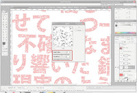
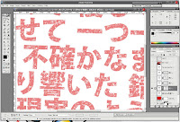
This is a simple technique to grungify a layer or layer grouping. It basically knocks a bunch of holes in the layer so that other layers can peep through. It uses layer masking and some basic Photoshop filters, and has plenty of room for experimentation.

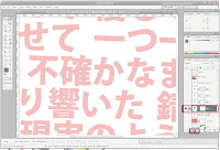
1. First off, on the layer (or layer group) you're interested in grungifying, you'll need to add a layer mask (not a vector mask, just a straight up layer mask.)
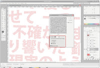
2. Add noise to the layer mask with the Noise filter. Crank it up to the max (400% in Photoshop 7) and make sure that you're using a Gaussian pattern and that the noise is Monochrome.
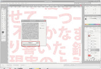
3. Blur the layer mask with the Gaussian Blur filter. The amount of blur you use will determine how patchy the grunge texture is as well as the size and distribution of the patches. Smaller blurs will result in speckled grunge. You probably don't want anything about 5px.
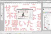
4. Adjust the layer's levels from the Image>Adjustments menu. You should see a hill figure, and 3 triangular sliders underneath. You'll want to concentrate all three sliders near each other, as this will create sharper edges on your grunge. If you concentrate the sliders near the left of the hill, you'll get sparse patches; if around the right of the hill you'll get dense patches. Adjust as you see fit.
5. Add some randomness to your grunge by using various Photoshop filters on the layer mask. You'll want filters that work well on black/white layers. Some good filters to start out with include most of the Brush Strokes filters, some of the Texture filters and some of the Sketch filters. Play around with their settings until you get something you like. You can apply multiple filters or none at all.
6. You're done!
Screenshots of me applying grunge to a text layer (which ultimately did not make it into the final wall) based on the steps above, with areas of interest highlighted: