Showing posts with label techniques. Show all posts

May 30, 2008

Monster Walltip: Quick Grunge Textures

I'm hoping to start up a new series in this blog called Walltips. They'll be short posts related to any walls I add. I plan for them to range from topics such as techniques used in the walls to discussion of layouts, colors, in-progress screenshots, decompositions, and whatever else I feel like rambling on about. So in today's inaugural Walltip from the wallpaper Monster, quick and easy grunge textures!

This is a simple technique to grungify a layer or layer grouping. It basically knocks a bunch of holes in the layer so that other layers can peep through. It uses layer masking and some basic Photoshop filters, and has plenty of room for experimentation.

1. First off, on the layer (or layer group) you're interested in grungifying, you'll need to add a layer mask (not a vector mask, just a straight up layer mask.)
2. Add noise to the layer mask with the Noise filter. Crank it up to the max (400% in Photoshop 7) and make sure that you're using a Gaussian pattern and that the noise is Monochrome.
3. Blur the layer mask with the Gaussian Blur filter. The amount of blur you use will determine how patchy the grunge texture is as well as the size and distribution of the patches. Smaller blurs will result in speckled grunge. You probably don't want anything about 5px.
4. Adjust the layer's levels from the Image>Adjustments menu. You should see a hill figure, and 3 triangular sliders underneath. You'll want to concentrate all three sliders near each other, as this will create sharper edges on your grunge. If you concentrate the sliders near the left of the hill, you'll get sparse patches; if around the right of the hill you'll get dense patches. Adjust as you see fit.
5. Add some randomness to your grunge by using various Photoshop filters on the layer mask. You'll want filters that work well on black/white layers. Some good filters to start out with include most of the Brush Strokes filters, some of the Texture filters and some of the Sketch filters. Play around with their settings until you get something you like. You can apply multiple filters or none at all.
6. You're done!
Screenshots of me applying grunge to a text layer (which ultimately did not make it into the final wall) based on the steps above, with areas of interest highlighted:

Dec 29, 2007

Making Katamari in the Snow

Here's a quick rundown on how I watercolored "Katamari in the Snow".
First, I started with the vector trace (Illustrator 9):

Then I moved on to Painter 9 and the watercolor tool:

This is similar to how I've watercolored previous works (such as Mountain's Red Leaves.

Jul 14, 2007

More on wallpaper resolutions

For my recent Escaflowne wallpaper, I decided to try a different approach to the issue of cropping for various monitor resolutions. Usually I design an image as widescreen, and then crop off the sides to fit 4x3 and 5x4 monitors. This is not a very good solution, as this often means nice details are in danger of getting cropped. This time around I tried to overlay the 3 different resolutions, so the widescreen gets a little cropped off the top and bottom, and the 5x4 gets a little cropped off the sides, but this way less is cropped total.
What do I mean?

[Note: this was an in-progress version of the wallpaper in Illustrator, back when I thought I'd make it predominantly blue.]
I think I shall use this method from now on.

Apr 22, 2007

What's in a resolution?

Wallpaper resolution is a tricky thing. There are so many different sizes of monitors out there nowadays that it's hard to design for all of them. Generally, you just crop things to the right aspect ratio, which does mean you have to be careful about element placement.
I have a dual widescreen monitor display at work, and generally speaking, this is a rare thing to find. So every so often I make one for myself.
The question was, how do I make this wall look good on dual screens and single screens?
The answer: Move elements around.
I made two wallpapers here: a dual monitor version, and a single monitor version, and then cropped them to fit the relevant aspect ratios.
Dual monitor versions:


Single monitor versions:


It makes a difference, doesn't it?

Apr 20, 2007

Useful resource for typography

Thanks to the Google Personalized Homepage's new "Recommendations" feature, I found the following website:
Identifont
It allows you to either
a) Look up a font face by name
b) Look up a font by distinguishing features

B is time-consuming as it asks you to examine all the details possible on the font - the style of the lowercase 'g' or uppercase 'K', or how many lines are in a $, etc.
I haven't tried it out on any fonts in particular, but it looks extensive and possibly quite powerful, if you're trying to figure out a font someone else has used - or at the very least find something of a similar vein.

In either case, it'll return a graphic of the font (showing alpha characters) as well as information on the font and where you might be able to purchase it.

Nifty!

Mar 16, 2007

A run down of Painter IX's brushes (Part I)

This is an exploration of Painter IX's default brush set. Painter has a ton of brush sets mimicking natural media, and is best utilized with a tablet to gain pressure sensitivity. There are so many types of brushes, that it's hard to know which brush has what effects.

This is based off of Painter IX's brush set. Brush sets in other versions of Painter will vary. Painter arranages its brushes by categories, which are fairly broad collections of brushes with similar settings. They tend to vary by effect, brush size, brush tip shape, and pressure sensitivity.

What the chart means

  • Wet/Dry: Painter has two types of brushes: Wet and Dry. Wet brushes must be used on a "wet" layer, and cannot interact with Dry brushes unless the wet layer is dried. There is also a hybrid "digital wet" brush that combines some aspects of both wet and dry brushes (they combine the characteristics of wet brushes, but can be used on dry layers directly.) Some categories contain brushes for both sets (there are both wet erasers and dry erasers, for example.)
  • Blending: Some brushes pick up the color of other paints around them. Some do not.
  • Opacity: Some brushes have a greater dynamic range in opacity than others.
  • Brush tip: The general brush tip shape
  • Paper Grain: Denotes whether a brush picks up the texture of the paper's grain.

    Left: Where to change your paper's grain | Right What grain means for a Painter brush
  • Buildup: Some brushes build up color as you pass the brush over the same area multiple times.

    Above: Two brushes with different buildup characteristics.

And now, on to the brushes!

Acrylics [general info]

  • Sample brushes: thick acrylic bristle, thick opaque acrylic, wet acrylic
  • Wet/Dry: Dry.
  • Blending: Varies. "Wet" or "soft" acrylics tend to pick up more colors than other acrylics.
  • Opacity: Generally opaque. Slight opacity on brush edges.
  • Brush tip: Varies. Distinct brush fibers or flat tips.
  • Paper Grain: None
  • Buildup: None

Airbrushes [general info]

  • Sample brushes: coarse spray, soft airbrush, variable splatter
  • Wet/Dry: Dry.
  • Blending: None
  • Opacity: Varies from entirely opaque to almost entirely transparent. "Soft" airs are the most transparent.
  • Brush tip: Round, with either soft or hard edges. Most brushes have a spatter radius.
  • Paper Grain: None
  • Buildup: None

Artist Oils

  • Sample brushes: dry bristle, impasto oil, tapered oils
  • Wet/Dry: Dry.
  • Blending: High
  • Opacity: Mostly opaque
  • Brush tip: Generally square, tapers quickly.
  • Paper Grain: None
  • Buildup: None

Artists

  • Sample brushes: Impressionist, Seurat, Van Gogh
  • Wet/Dry: Dry.
  • Blending: None
  • Opacity: Generally opaque
  • Brush tip: Variable. Each brush is unique, mimicking a different artist's style.
  • Paper Grain: None
  • Buildup: None

Blenders

  • Sample brushes: Grainy blender on Pens, Oily blender on Oils, Soft blender on Pastels
  • Wet/Dry: Dry. Watercolor and Digital Watercolor blenders are contained in their respective categories.
  • Blending: Blenders are used to blend paints that have already been laid down on the canvas.
  • Opacity: N/A
  • Brush tip: Variable, but generally round
  • Paper Grain: None
  • Buildup: N/A

Calligraphy [general info]

  • Sample brushes: calligraphy brush, thin grainy pen
  • Wet/Dry: Dry.
  • Blending: None
  • Opacity: Fully opaque
  • Brush tip: Thin and at an angle
  • Paper Grain: None
  • Buildup: None

Chalk [general info]

  • Sample brushes: blunt chalk, square chalk, variable width chalk
  • Wet/Dry: Dry.
  • Blending: None
  • Opacity: Mostly opaque
  • Brush tip: Round or square
  • Paper Grain: Yes, generally strong
  • Buildup: None

Charcoal [general info]

  • Sample brushes: dull charcoal pencil, soft charcoal, soft vine charcoal
  • Wet/Dry: Dry.
  • Blending: None
  • Opacity: Mostly opaque
  • Brush tip: Round or square
  • Paper Grain: Yes, generally mild
  • Buildup: None

Cloner

  • Sample brushes: camel oil cloner, furry cloner, smeary flat cloner, all using same base pattern
  • Wet/Dry: Wet and Dry
  • Blending: None
  • Opacity: Varies.
  • Brush tip: Varies
  • Paper Grain: Varies
  • Buildup: Varies

Colored Pencils [general info]

  • Sample brushes: colored pencil, oily colored pencil, variable colored pencil
  • Wet/Dry: Dry
  • Blending: Some
  • Opacity: Partially transparent
  • Brush tip: Round and small
  • Paper Grain: Yes, generally mild
  • Buildup: Yes, generally mild

Conte [general info]

  • Sample brushes: dull conte, square conte, tapered conte
  • Wet/Dry: Dry
  • Blending: None
  • Opacity: Mostly opaque
  • Brush tip: Round or square, dense bristles
  • Paper Grain: None
  • Buildup: None

Feb 14, 2007

Wallpaper Walkthrough: Painting "Under the Sakura"

This is a special Paint-o-Rama walkthrough for my wallpaper, "Under the Sakura" as part of the "Let there be Light" contest.

I used Photoshop 7.0 for scan reconstruction/post production and Painter 9.0 for watercolors.

Preparation: Scan Extension
I started off with this scan of Takamichi's artwork. Since this artwork was vertical, I basically had to redraw a bunch of cherry tree branches. You can see that process in this breakdown by layers.
The "sketch" layer was used to get a feeling for where I should start adding or extending the branches so that the wall felt full, and I didn't feel obliged to follow it too closely.
The "flowers" layer consists of 2 different flower sets extracted from the original scan, repeated at different intervals. In order to keep it from looking regular, I rotated most of the clones and resized them. As long as you can keep from creating a pattern, you should be able to distract the eye enough that people won't realize the flowers are cloned for a while.


Preparation: Setting up Painter
First, I set up the Painter interface. I took the extended scan from Photoshop and saved it as a bitmap. I opened this in Painter, moved the image from the background to a layer on top, reduced the opacity to 25% and locked it to prevent myself from accidentally moving or painting on it. I also set the background to a pale blue color. That way I'd know where I'd painted and where I hadn't.
I had the original bitmap open again so I could use it as my clone source. Then I set up my watercolor brush to clone and was ready to start painting!


Branch painting 1 - coloring the inside
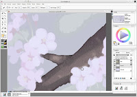
To start painting the branches (which are outlined) I first painted the inside of the branch with a 3-5px brush. You can see in the screenshot that the strokes overlapped the flowers. As long as the center of the brush doesn't cross over the edge of the flower, it will continue to paint in brown (that's why I use a larger brush.) I'll clean up the flowers' edges later, but this ensures there are no gaps.


Branch painting 2 - coloring the outside
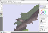
To continue painting the branches, I next painted the outside of the branch (the grassy area) with a 3-5px brush. I overlapped the grass over the edge of the branch similar to how I overlapped the flowers' edges in the previous step.


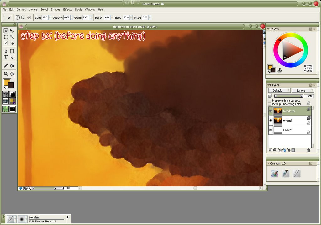
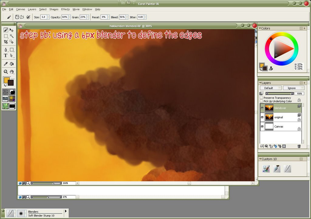
Branch Painting 3 - coloring the edges
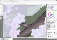
With a 1px brush, I went back and cleaned up the edges of the branch, making sure that I covered up all of the overlapping grass from the previous step. The 1px brush is laborious to use and usually too sharp for a good watercolor effect, so use it sparingly for the most fine of details, and stick with 3-5px brushes for most other parts (or for large swathes of grass, use 10-15px brushes to save time.)


Flower painting
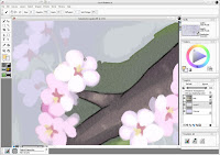
Painting the flowers uses the same ideas as painting the branches, except the flowers have no black edge on them. Start by painting from the center outwards. Since the branch painting steps already created an overlap, paint over the branch to create a nice crisp edge for the flowers. For the flower petals I used a 3-4px brush, and for the flower pistils/stamens, I used a 2px brush. For flower stems, I used a 1-2px brush.


Tree painting
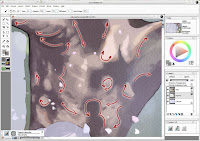
Painting the tree is similar to painting the branches. Where branch texture tends to go in one direction, however, the trunk of the tree has textures going in all directions. When painting a section like a tree trunk, always keep in mind which direction your brush strokes should go in to maintain a good edge and transition between colors.


Painting the girl
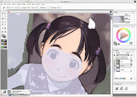
Painting the girl is just like painting the rest of the wall. However, the girl has the most details, so you'll want to be very careful with edges and corners. This is about the only place where I used the 1px brush extensively.


Done!
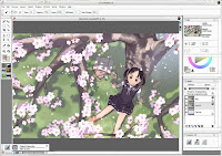
Keep painting and painting and eventually you'll finish!
You might notice that I redid the grass on the left side of this screenshot compared to the Painter prep screenshot. After watercoloring the grass, the scan extension didn't mesh well with the scan, so went back and added more details, more gaps in the shadows, and more variations in the green. I thought I could be lazy, but that didn't work out.


Post-Production
After I finished watercoloring, I saved it as a bitmap again and opened it up in Photoshop for post-production. This involved some color and level adjustment (I toned down the saturation of the image and skewed it towards pink) and adding some extra watercolor texture (so that even the white areas show texture, as you might expect from seeing a watercolor on paper), and added some text (which took a while to figure out.) Then you're ready to export as jpegs and post it for all to see.

Well, that's one way you can create a wallpaper that looks like it was watercolored. Hope you learned something along the way, or at least had fun seeing how this wall was put together.

Dec 1, 2006

Ramblings on Mushishi: Mata Itsuka

NOTE: I just found this half-finished entry in my "potential blog topics" Google Notebook when I was doing some testing during work, so I decided to finish and post it, no matter how late it is.

One of the motivations behind turning my recent Mushishi wall, Mata Itsuka, from a vector-only wall (like Oyako) to a painted wall was to gain more familiarity with Corel Painter 9. I've had Painter for years (although only upgraded to 9 last year) but have only used it extensively for a few wallpapers. Frankly, having no experience in natural media aside from pencil/pen and paper, the number of options overwhelms me, and I have no basis for understanding how the oil-based brushes are supposed to work compared to, say, oil pastels. Still, a painting-based wall was just the excuse necessary to get more practice!
The last wall I used Painter on was the Okama Hunter in the Grass wall where I used the digital watercolor brushes to create a textured background. I went back to the digital watercolor tools (not to be confused with Painter's watercolor tools which is an entirely different palette) because I liked how they maintained the paper texture, and because I like the watercolor look in general.
One of the first things I discovered was Painter's custom brush maker. This thing is about 25x more complicated than Photoshop's custom brush maker and about 50x as fun, because you can actively preview the brush while you're making it but before committing to the changes. Very slick. I wasted probably several hours just messing around with controls, although in the end I created a new digital watercolor brush quite similar to the presets but with more control over the brush size based on tablet pressure and a fixed opacity (the presets were switched in pressure control on size/opacity).
Basically, I began by painting the base color for Ginko's face, then adding successive layers of shadow and highlights. I painted way outside of the outlines as I planned to mask the final color layers in Photoshop. After several frustrating attempts to figure out how to use the digital watercolor blenders, I gave up and decided to use the regular set of blenders. However, in Painter, you have to 'dry' any liquid ink layer (such as digital watercolor) before you can use the "dry" brushes (which include blenders, oils, etc.) Afterwards, though, the regular blenders were most intuitive to use and everything went from a sorta cel-style shading to a much softer gradient-style shading.
I like Painter's blenders a lot, and plan to use them in many more painty walls.

Nov 25, 2006

Tutorial: Painting "Mountain's Red Leaves"

Here is the tutorial segment of my Hakkenden "Mountain's Red Leaves" Paint-o-rama contest entry. It describes how I created the wallpaper, step by step. Click on each image thumbnail for the full screenshot.

Step 0: Preparing the Image
I found the scan of Hakkenden from AnimePaper and decided to use it for my wallpaper. However, to make a wallpaper I had to extend the image horizontally to fit the widescreen format. This was achieved in Illustrator, using fairly simple paths to define the shape of the trees, and then applying several effects of roughen and twist at low levels to create the jaggy edges that defined the leaves. The image was then exported to Photoshop at 200% size where some texture was added.


Step 1: Base Layer
I created a new blank canvas in Painter, and then opened my prepped image, setting this as the clone source. With a very large watercolor brush I basically filled the canvas with color. At this stage it wasn't very important to get all the details right - just make sure the canvas is covered. This fills the large areas (like the orange sky and the darkest layer of trees) quickly and easily.
It's useful to have a copy of the original as the top layer in your file, set at a low transparency. Although you can use 'tracing paper' to see a semi-transparent version of your clone file, you don't have any control over it. Having it as a layer means you can show or hide at will, change the transparency levels, etc, so it's easy to see what you're cloning from.


Step 2: Start adding details
Using a smaller brush (half the size of the first brush) I began to more closely define the edges. I don't repaint the entire image, just the edges. Note that in using the watercolor option in Painter you get white halos around the brush. Be sure to have plenty of extra space at your edges, so you can easily remove them with a soft eraser when you are finished.


Step 3: Second verse, same as the first
Continue as before using yet a smaller brush. Also, be sure to lock your previous layers, as it will prevent you from painting over a finished layer.


Step 4: Small enough for details?
When you get down to 8px you can actually define all the details at the edges. In this step I used not only 8px brushes but also 4px and 2px for especially detailed areas (the area around the geisha, and the bridge, for the most part.)


Step 5: Blend it all together
After the watercolor portion is done, you'll want to erase those halos I mentioned earlier. I did that in Photoshop (because I could select the layer's transparency and use a feathered mask on the layer.) Afterwards all of the layers were merged. The canvas was also extended ~50px in all directions and the color cloned at the top. This is because when you use the blender tools in Painter, it pulls an average color of what is beneath your brush - and at the edges of the canvas, it pulls in white, giving you a bad frame effect.
Like before, use a large blender for expediency, and smaller blenders when you're painting around the edges. Below is a typical workflow:
Step 5a: (the before shot)
Here is the edge of a tree, before anything is done.


Step 5b: Blending the edges
First, using a small (6px) blender, define the edges of the tree. Since all the trees have scalloped edges, make sure your brush stroke is in the same type of semi-circle. Also, by going slightly beyond the edge of the tree, you'll pull in the lighter color behind it. This gives the edges a bit of glow and adds depth.


Step 5c: Filling the interior
Using a larger (12px) blender, fill in the rest of the tree. This technique could also be useful in painting clouds, as they have the same scallop edges and lighting emphasis.


After the blending step, there were some final post-production steps in Photoshop - cropping the extra pixels out from step 5, adding a hint of texture to emphasize the painting style, text (a haiku from Issa), and final colors and levels adjustment. Finally, add your signature and post it on your website!