First, I started with the vector trace (Illustrator 9):

Then I moved on to Painter 9 and the watercolor tool:

This is similar to how I've watercolored previous works (such as Mountain's Red Leaves.
This is an exploration of Painter IX's default brush set. Painter has a ton of brush sets mimicking natural media, and is best utilized with a tablet to gain pressure sensitivity. There are so many types of brushes, that it's hard to know which brush has what effects.
This is based off of Painter IX's brush set. Brush sets in other versions of Painter will vary. Painter arranages its brushes by categories, which are fairly broad collections of brushes with similar settings. They tend to vary by effect, brush size, brush tip shape, and pressure sensitivity.
What the chart means


And now, on to the brushes!
 Acrylics [general info]

 Airbrushes [general info]

 Artist Oils

 Artists

 Blenders

 Calligraphy [general info]

 Chalk [general info]

 Charcoal [general info]

 Cloner

 Colored Pencils [general info]

 Conte [general info]

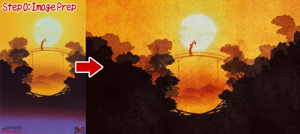 I found the scan of Hakkenden from AnimePaper and decided to use it for my wallpaper. However, to make a wallpaper I had to extend the image horizontally to fit the widescreen format. This was achieved in Illustrator, using fairly simple paths to define the shape of the trees, and then applying several effects of roughen and twist at low levels to create the jaggy edges that defined the leaves. The image was then exported to Photoshop at 200% size where some texture was added.
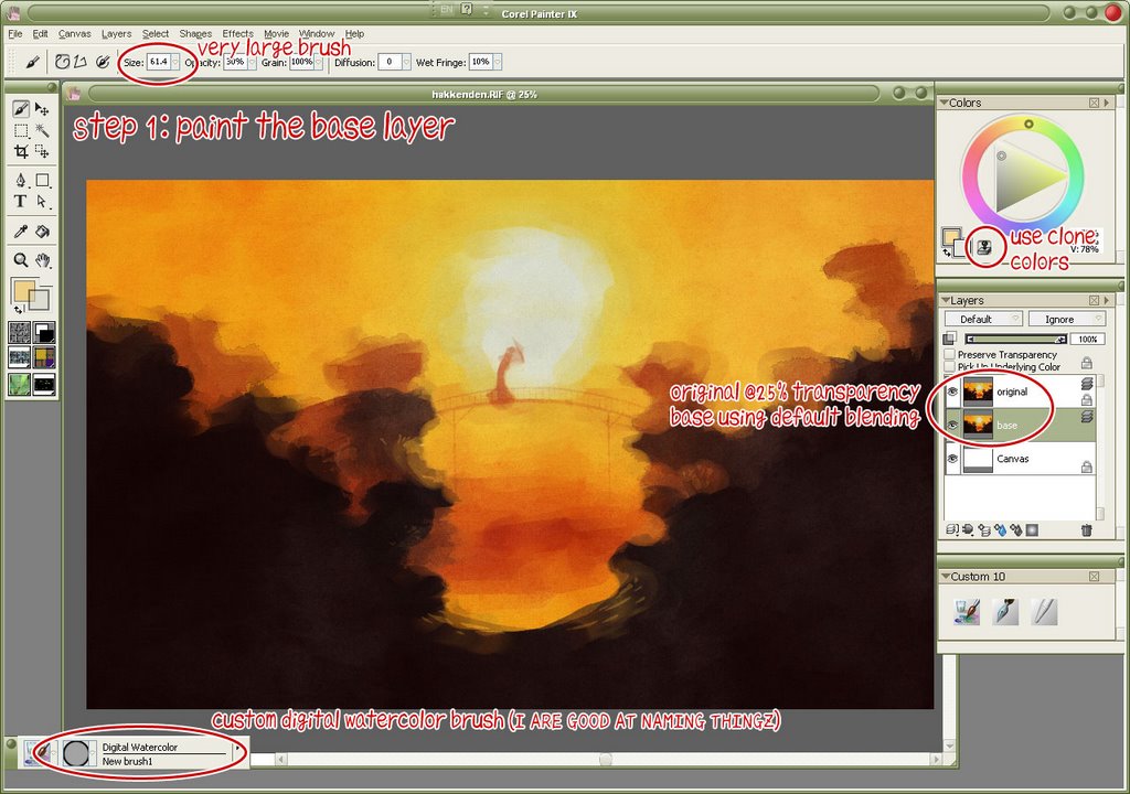 I created a new blank canvas in Painter, and then opened my prepped image, setting this as the clone source. With a very large watercolor brush I basically filled the canvas with color. At this stage it wasn't very important to get all the details right - just make sure the canvas is covered. This fills the large areas (like the orange sky and the darkest layer of trees) quickly and easily.
 Using a smaller brush (half the size of the first brush) I began to more closely define the edges. I don't repaint the entire image, just the edges. Note that in using the watercolor option in Painter you get white halos around the brush. Be sure to have plenty of extra space at your edges, so you can easily remove them with a soft eraser when you are finished.
 Continue as before using yet a smaller brush. Also, be sure to lock your previous layers, as it will prevent you from painting over a finished layer.
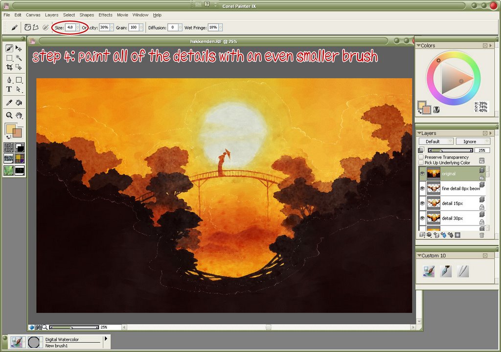 When you get down to 8px you can actually define all the details at the edges. In this step I used not only 8px brushes but also 4px and 2px for especially detailed areas (the area around the geisha, and the bridge, for the most part.)
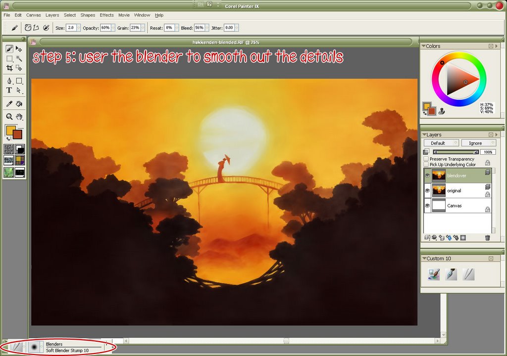 After the watercolor portion is done, you'll want to erase those halos I mentioned earlier. I did that in Photoshop (because I could select the layer's transparency and use a feathered mask on the layer.) Afterwards all of the layers were merged. The canvas was also extended ~50px in all directions and the color cloned at the top. This is because when you use the blender tools in Painter, it pulls an average color of what is beneath your brush - and at the edges of the canvas, it pulls in white, giving you a bad frame effect.
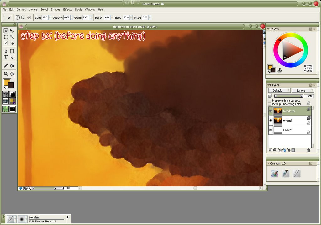 Here is the edge of a tree, before anything is done.
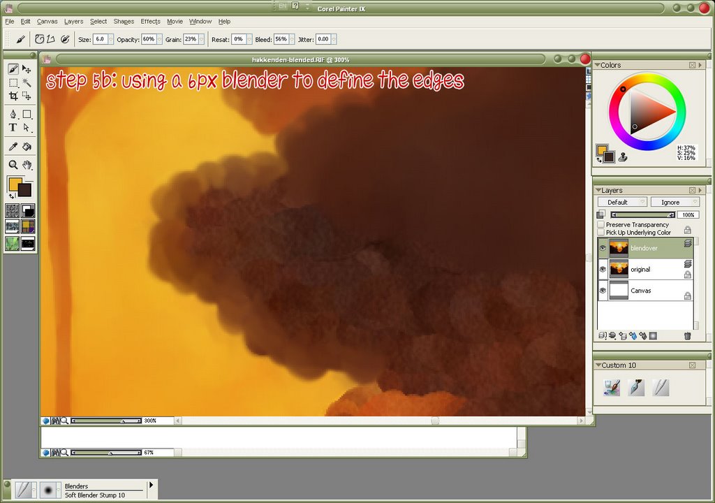 First, using a small (6px) blender, define the edges of the tree. Since all the trees have scalloped edges, make sure your brush stroke is in the same type of semi-circle. Also, by going slightly beyond the edge of the tree, you'll pull in the lighter color behind it. This gives the edges a bit of glow and adds depth.
 Using a larger (12px) blender, fill in the rest of the tree. This technique could also be useful in painting clouds, as they have the same scallop edges and lighting emphasis.